Orange is the result of mixing yellow and red. Therefore, it has the properties of both colors. From the first he "took" cheerfulness, fun and optimism, from the second - activity, sensuality and energy. Intense orange - stimulates the appetite, so it is appropriate for decorating the kitchen.
Characteristics
Psychological: invigorating, active, appetizing
Associations: oranges, sunset, autumn.
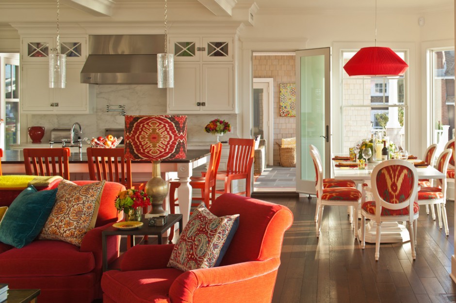
Just imagine, in the early morning, walking sleepily in the direction of the kitchen, thinking that the morning would be better if it came a little later, go into the “tangerine”, “carrot” or “honey” room and get such a charge of vivacity and positive mood which you couldn't even dream of! The color is also good because in such a kitchen it is simply impossible to complain about a poor appetite. And after drinking a cup of fragrant coffee or tea from an orange cup, you will immediately feel a surge of kindness and hospitality! In addition, the color is conducive to spiritual communication, so your household will not have any secrets and grievances, which will greatly facilitate everyone's life. That's why a kitchen in orange is very good option both for families and singles. Perhaps, soon, after decorating the kitchen in this sunny color, feeling its favorable influence, single people will meet a soul mate. Indeed, often the reason for loneliness is that people, overtired at work, hardly “crawl” to the house in a dull mood and close themselves off from everyone and everyone, enjoying their boring and lifeless “shell”. And the color that is associated with fun and happiness will increase mood and self-esteem, enhancing the desire to communicate.
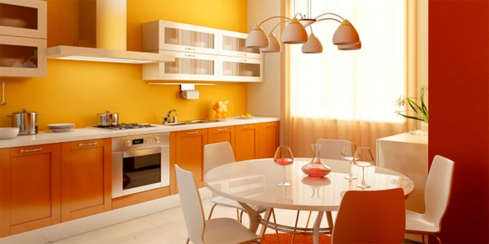
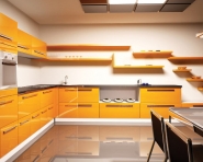
Orange kitchen is bright and colorful! You are guaranteed a wonderful mood.
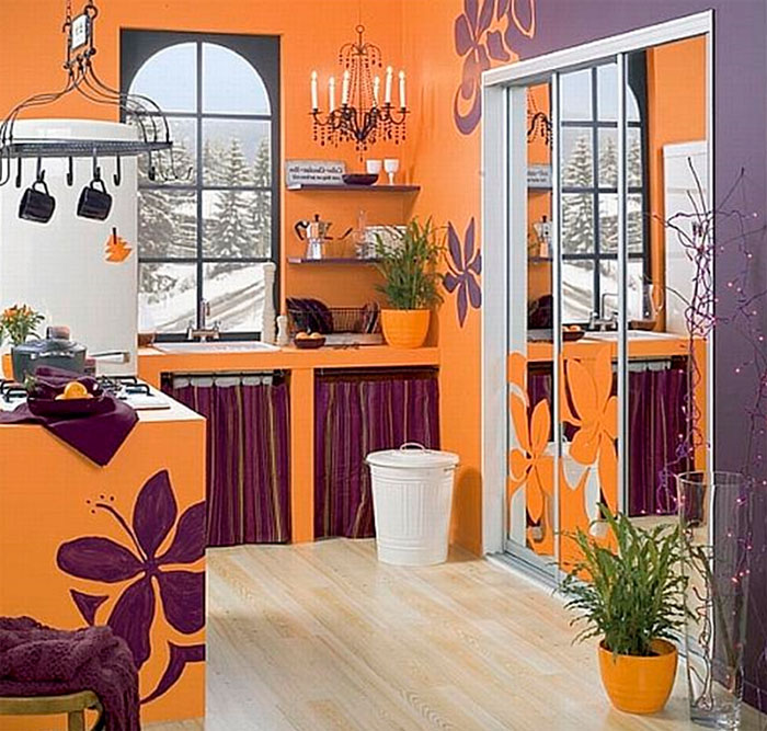
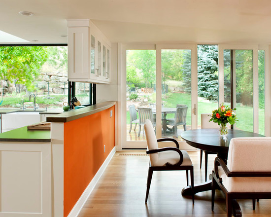
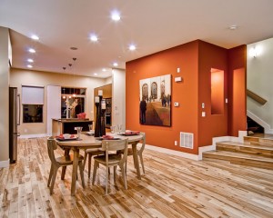
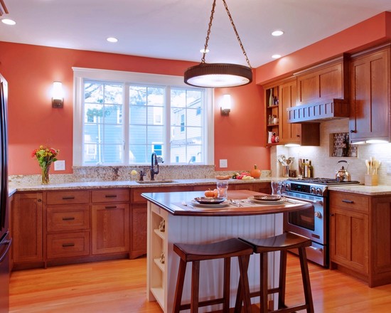
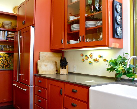
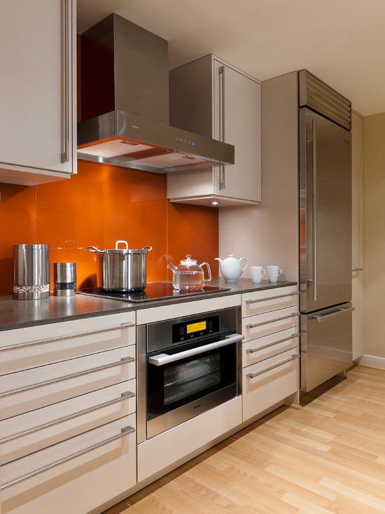
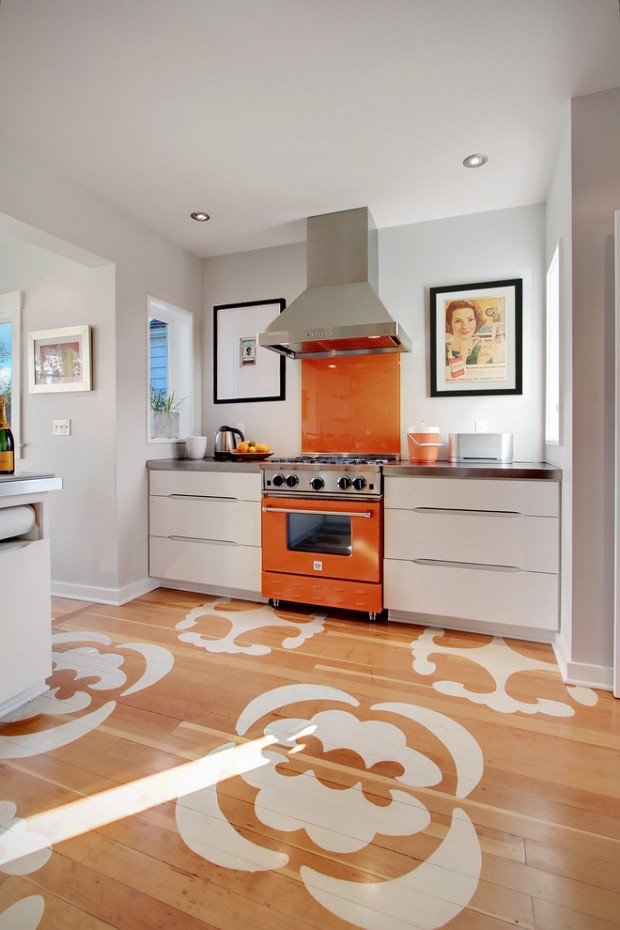
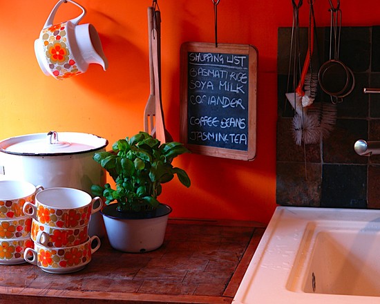
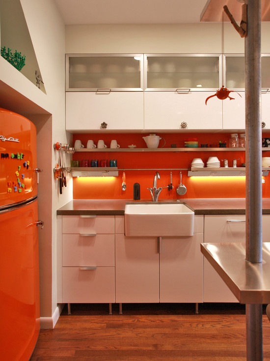
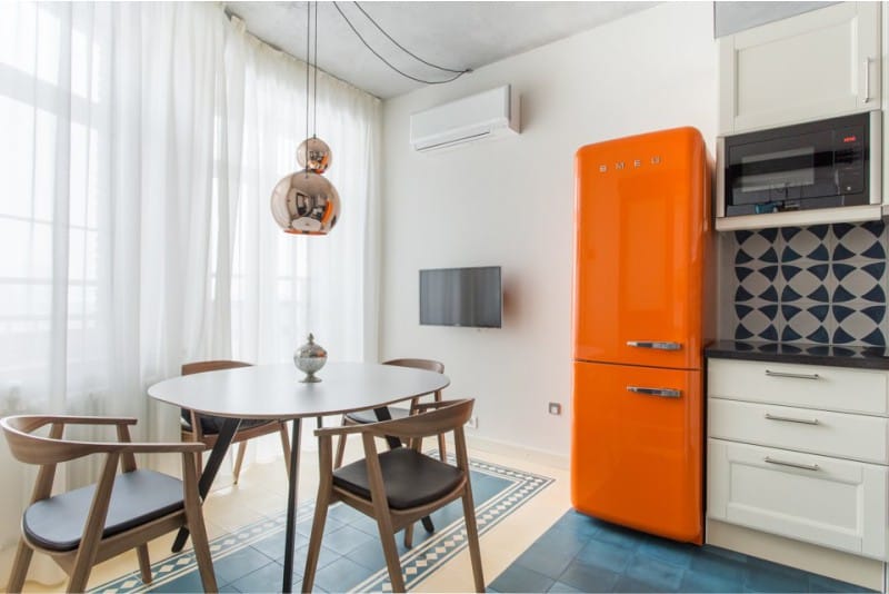
orange walls in the kitchen
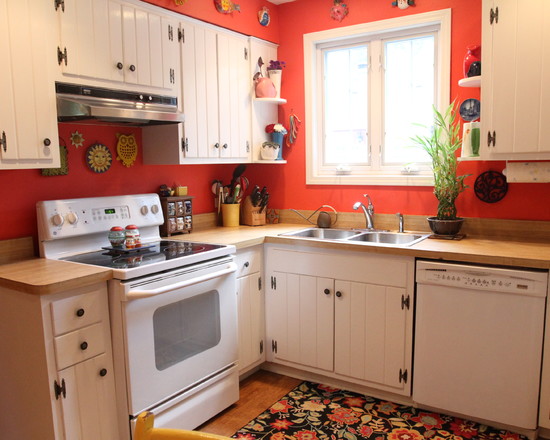
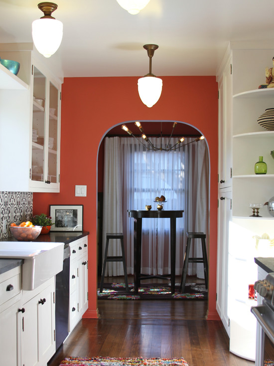
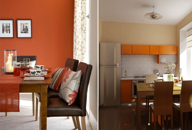
If the walls in the room have an orange color, then it is automatically assumed that this color is the main one and it is more than 30%. This color scheme can be advised to those people whose windows face the north (or dark) side of the house. If the sun does not want to come to you, then design will bring it!
What kind of wall decoration to choose? Finding orange wallpapers is quite difficult, they are almost never released. Therefore, the best option is the usual painting. Or more complex analogues: wallpaper for painting, decorative plaster, glass wallpaper.
Lighting scenarios. In an orange kitchen, it is important that the lighting is bright. Ideal spot lighting. Floor lamps and a variety of lamps harmoniously look in the orange room.
Which ceiling to choose? The glossy ceiling, which reflects glimpses of orange, looks elegant and unusual, it is very intriguing and spectacular! Such a ceiling is most appropriate in an orange kitchen.
What furniture and accessories to choose for orange walls? Orange has hundreds of shades. His palette is rich and varied. The kitchen can be decorated both in saturated shades and in neutral ones. If you value home comfort above all else, then a chocolate set is ideal for orange walls. This option will not only give sophistication and elegance, but also surround with an atmosphere of home warmth and hospitality. Curtains for such a kitchen are suitable from a luxurious, dense fabric of a deep saturated color. The soft pistachio set with rich orange walls also looks great. Curtains should be matched with a headset made of light, transparent fabric. If you prefer white furniture, then the curtains should be airy, light or snow-white with orange patterns, or plain peach. Such curtains will not interfere with the penetration of sunlight, and the room will look spacious and solemn.
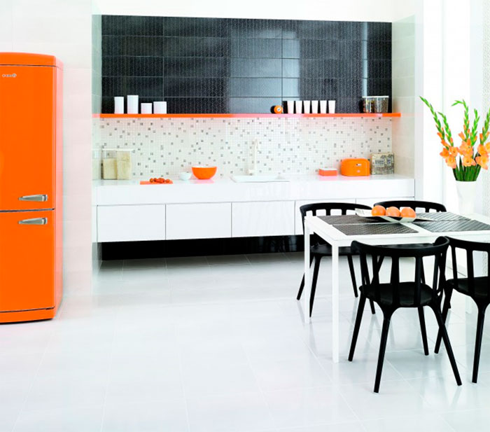
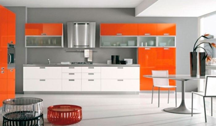
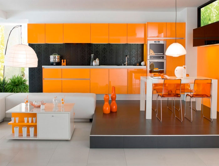
Combination of orange with black and white
The uniqueness of black and white flowers in that they can fit into almost any palette. Therefore, as usual, we begin the topic of compatibility with this duet.
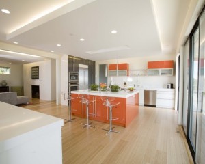
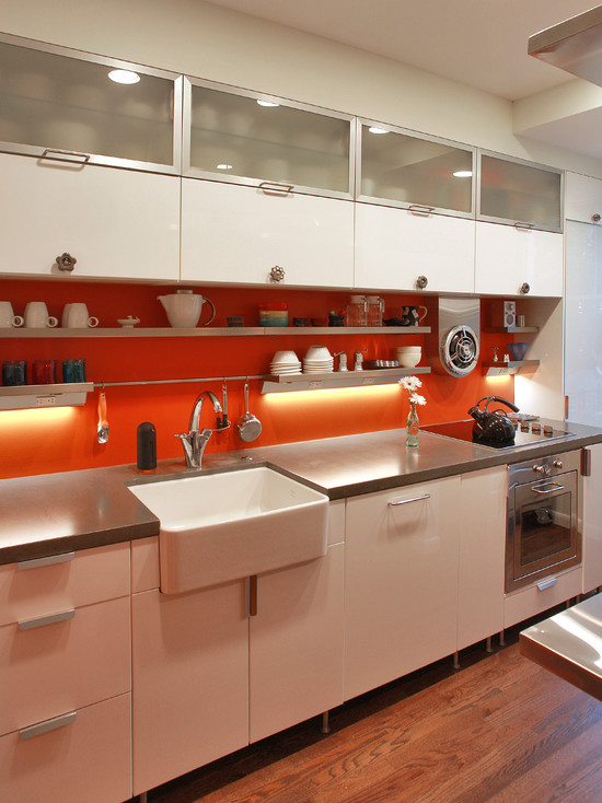
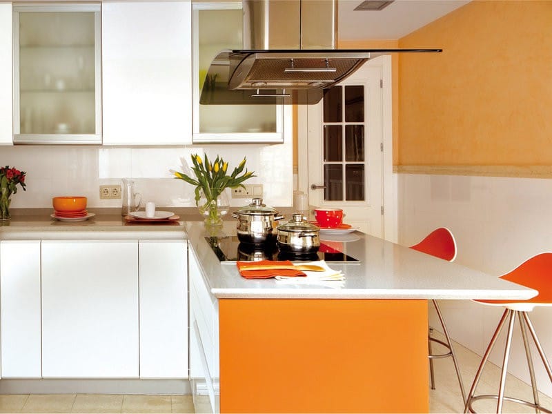
Orange and white kitchenette"Give" positive and freshness, besides visually enlarge the room. White is the background color, it is always eliminated, as it were, making it possible for another to solo. Therefore, orange will immediately take a dominant role.
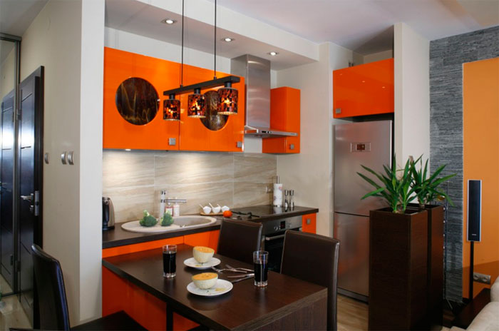
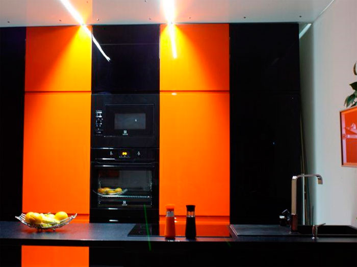
Black and orange kitchen- a very stylish combination, subject to the correct proportion. Black will contain and limit the rampage of our protagonist, because. it is the color of everything official (suits, boots, executive cars). In this way, a balance can be struck between the two antagonists. But remember that an overabundance of black will turn the kitchen into a gloomy and lifeless room. You need to be careful about choosing such a range in a small kitchen, most likely you will have to add a third color.
Trio: orange-black-white. A black and white interior is simplicity and traditionalism, but if you make orange the third, then notes of carelessness and fun will immediately appear. With the right proportions, you can achieve perfect harmony, as in the photo.
Other color combinations
Psychologists say that an excess of orange in a room increases appetite several times. Therefore, if you do not want to turn into a bright round orange, orange must be combined with other shades.
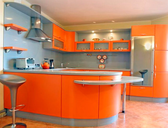
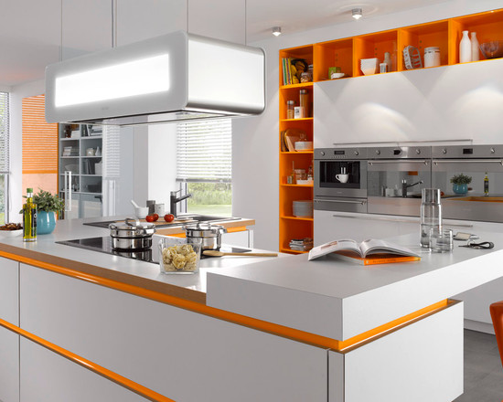
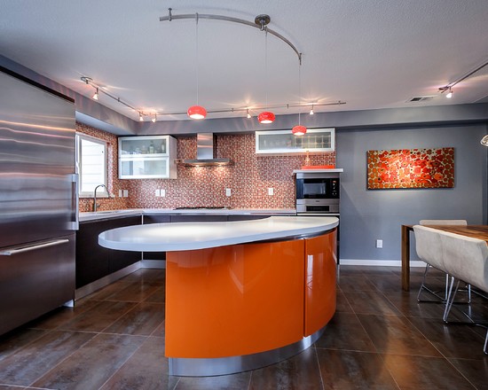
Gray-orange combination in interiors holds the palm among paired combinations. These colors work great together. Passive gray will dampen the activity of its neighbor. In addition, their styles are related. Gray has many shades, including silver (metallic), so it is often present in modern interiors high tech. It is in modern styles that rich orange is used more often than others.
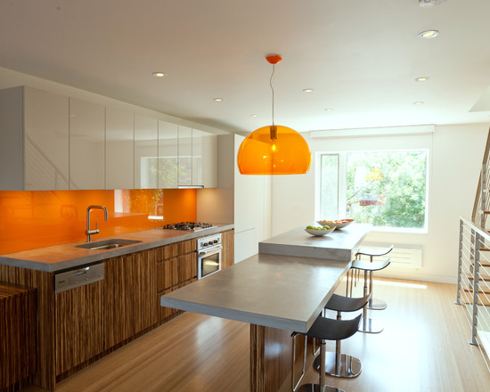
The combination of orange and blue in the kitchen. In the color wheel, this pair is opposite each other. You can imagine a sunny sandy beach on the shores of the blue sea and clear skies. Surely you would like to be in such a place. In an interior with such a range, cool blue will be refreshing.
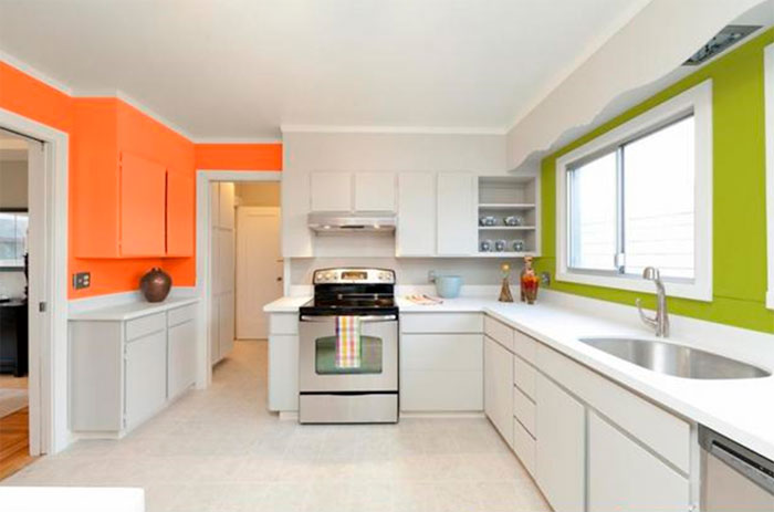
orange green the room will caress you with warmth and comfort, and charge you with a wonderful mood. Few people can help smiling as they look at the tangerine, framed by green foliage.
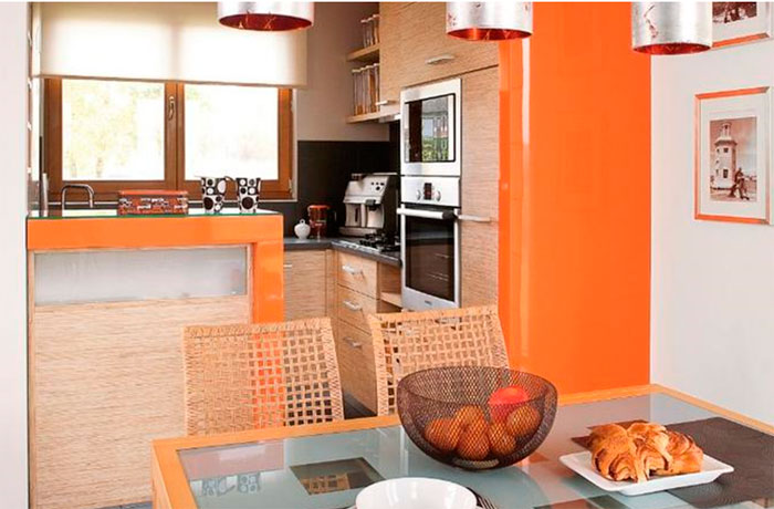
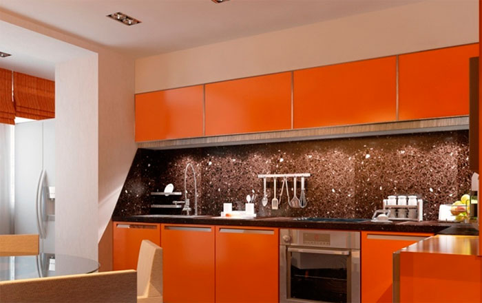
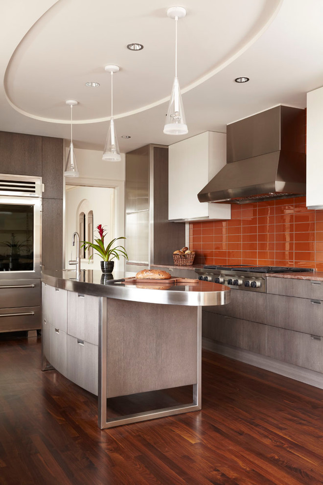
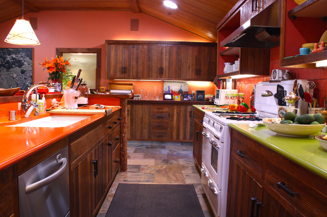
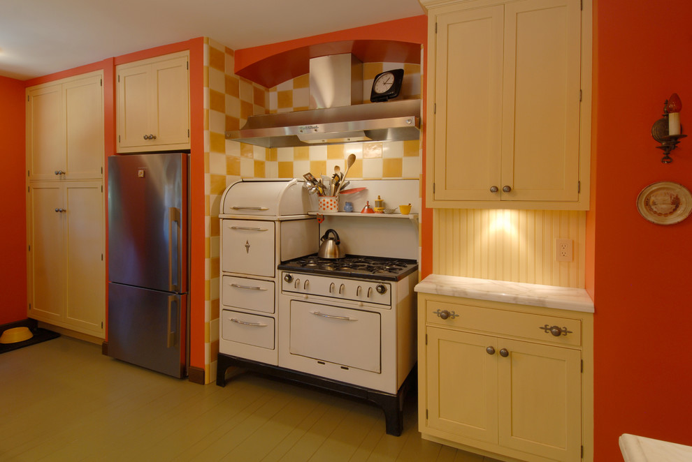
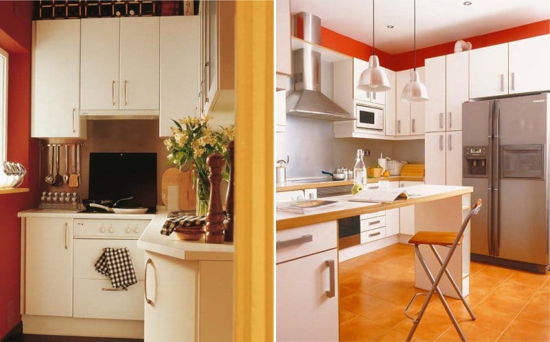
orange brown combination ideal for a small kitchen, emphasizing its dignity. Such a room looks noble, thanks to the chocolate color of the wood.
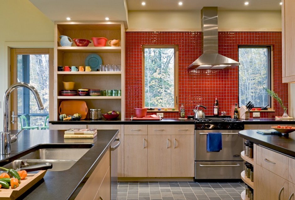
Orange kitchen apron
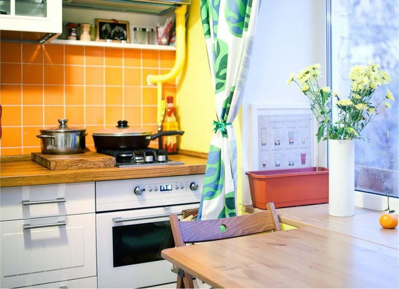
So far we've talked about the use of orange in general terms, now let's get down to specifics. Apron - the first important accent area in any kitchen. It is here that it makes sense to show all the design talents in the design. But here you will immediately run into a problem: finding typical finishing materials in orange is not so easy. Let's see what options are available.
What method of finishing the apron to use?
- - the most popular material for contrasting aprons. The panels have a perfectly smooth glossy surface. You can choose both a single color option and photo printing.
- with photo printing - a cheaper analogue of the first option;
- . It is difficult to find collections based on orange in the store, this color is too bold and rebellious, and manufacturers do not risk launching such patterns into mass production. It is much easier to find bright decors and use them.
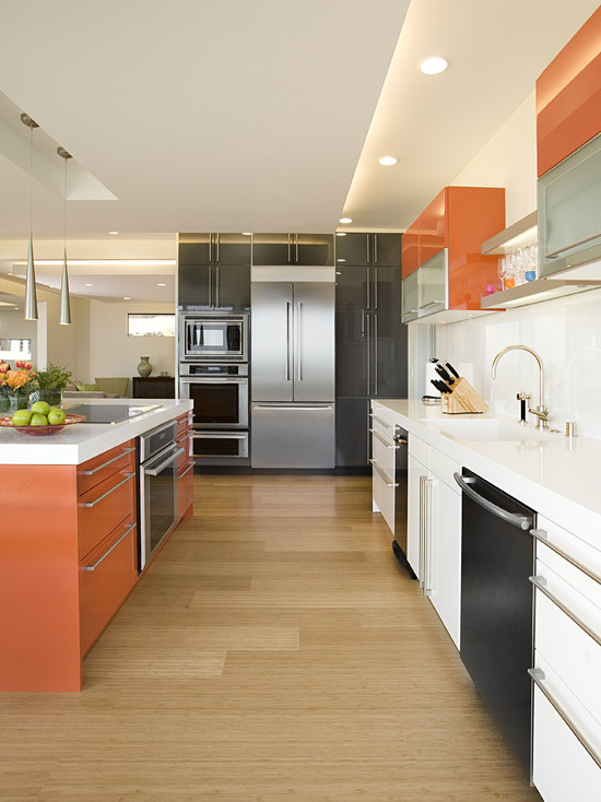
Orange furniture, kitchen facades
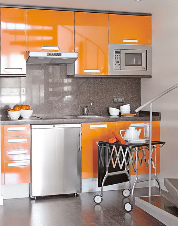
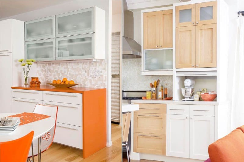
If you prefer neutral colors to orange walls - white, beige, pistachio or gray, then feel free to purchase a popular and unusually beautiful orange set. Looks stunning glossy headset, although many do not like him for his soiledness, especially if there are children in the house. In this case, you should choose a kitchen with matte facades, since you will have to clean them much less often, albeit more difficult. The headset can be completely orange or interspersed with other shades. Which also looks unusual and impressive.
Details, additions, accessories
If you didn’t dare to radically change the kitchen, but you really want to experience the emotions that only orange can “give”, feel free to bet on point accents. It is this color that designers like to use most of all as a marker, emphasizing the necessary details or bringing creative disorder into the interior. Orange vases with bright flowers, candlesticks, towels, rugs, dishes, figurines and bright fruits on the table will evoke only pleasant emotions. Get decorative stickers in the form of bright vegetables, fruits, flowers or butterflies, decorate walls, furniture and you will have more fun. See examples in the photo!
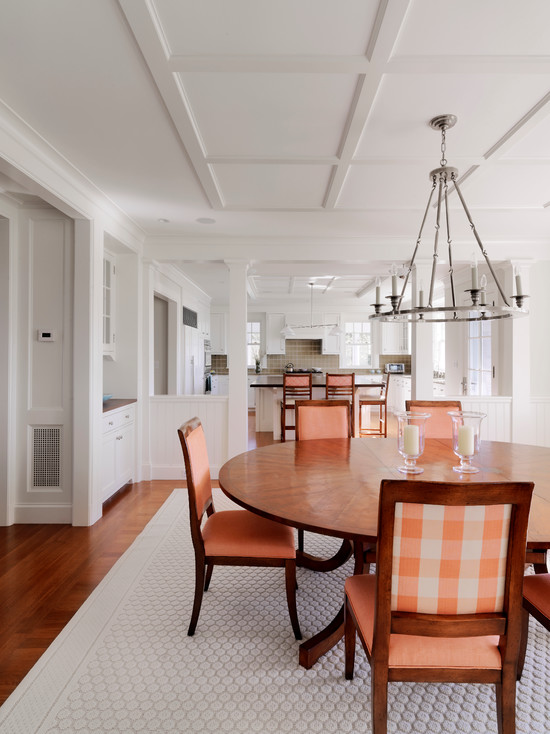
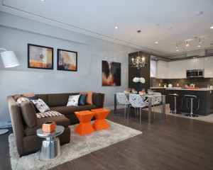
Orange adds energy and optimism and is associated with juicy fruits, summer sunsets and tropical vacations. You can take advantage of it positive energy when organizing the interior in your apartment or house.
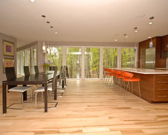
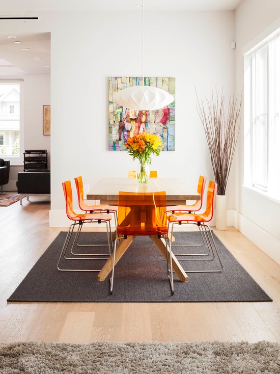
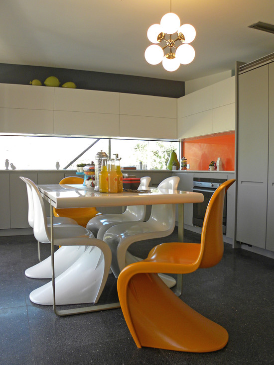
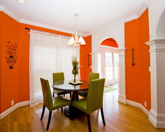
Intense saturated shades of orange are ideal for the dining room. A few of these elements in such colors are enough for the room to acquire energy and character. But we can also use this color as the main and dominant one. Remember, however, that other elements in this case should be more calm, muffled.
Do you dream of a kitchen in bright colors? An orange-colored kitchen simply captivates with a combination of bright colors and a warm atmosphere.
If your kitchen is small
In this case, it would be best if the interior was light and airy. This is the dream of many housewives. But what if we deviate from this ideal? Instead of choosing traditional trendy or not less trendy, but rather bulky, you should use your imagination and pay attention to orange. In this case, you should carefully choose cabinets for the floor and walls, take care of stylish accessories and additives, as well as the right lighting.

There are many options for introducing orange into the interior:
- orange furniture for the kitchen (cabinets, table and chairs);
- apron for the wall above the work area;
- wall color;
- color of accessories and additives (curtains, dishes, tablecloths, paintings, etc.).
Don't be afraid of this color. There are really many ways to introduce it into your space. It can effectively make the interior warmer and, therefore, lift our spirits. It has so many different shades that it is certainly possible to find among them one that perfectly reflects our tastes. We can choose a bright shade, a more muted ocher, or shades of red, brick red and salmon.
The energy that this color radiates will add enthusiasm to our daily activities. It will be very useful in the kitchen, where it will stimulate the appetite and inspire new culinary experiments. We can choose its monochrome version or one in which the orange is just a subtle accent, like a spice that adds a sophisticated flavor to the dish. Dishes, table mats or stools will show themselves especially well in this role.

![]()
A popular solution in modern interiors is the play of contrasts. The orange color is in a fairly favorable position, it contrasts beautifully with both dark colors and stands out beautifully against the background of light and pastel colors.
Choosing it as your primary color may seem crazy. However, you should know that this is only an appearance. It is enough to add a sharp orange color to the company of pastels - soft vanilla and white, and you will get a balanced interior that overflows with optimism. Experiment with colors and abandon stereotypes - the effect can really exceed your expectations.
On a white background, such facades and furniture elements look very representative.
This color looks fashionable and bright in or with green elements.

Very beautiful and fashionable combination of this color with gray. bright additives will revive. They will bring warm notes to gray furniture and make the room more comfortable.
Quite harmoniously, this bright color is combined with purple, which can be used both in additives and on cabinet fronts and walls, as well as on countertops and splashbacks.
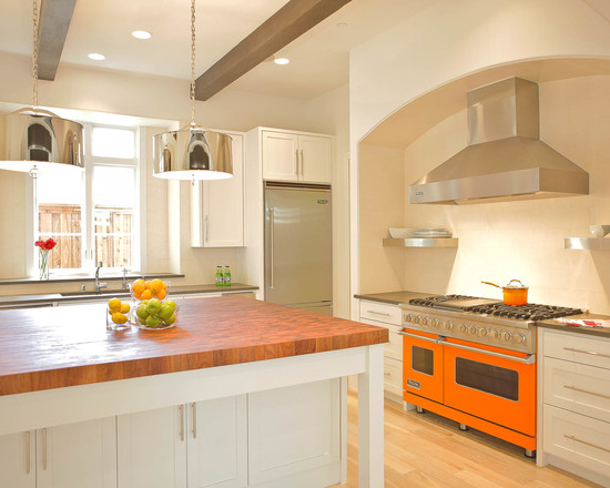
Elegant and expressive, this shade of fire and sun will look in or dark brown. This is one of the most popular options, after white.

You can also combine orange with yellow and red, these three warm colors will create a bright and sunny interior that will cheer you up in the morning and help you wake up faster even on a rainy day.
Modern cuisine loves combinations of vanilla shades, and in combination with orange she will delight all lovers unusual solutions. This solution is for the young and energetic.

Choosing pastels as a backdrop for bright facades, we get a kitchen full of charm. Off-white painted walls and light wood floors are ideal for this purpose. But do not overdo it with the number of bright additions, in otherwise you can get too flashy effect. Therefore, worth for the top kitchen cabinets choose light shades, vanilla and pastels. But the lower cabinets in the kitchen can be safely made orange. To visually connect the headset into one whole, choose uniform shapes and identical handles for all cabinets - preferably aluminum. If our kitchen is open, we can complement this arrangement with a light wood dining table and orange plastic chairs. An orange fruit bowl can be placed on the table.
The apron for this bright kitchen should be chosen in the color that will beautifully shade the facades. It can be metallic gray, shades of brown, white, beige, black, patterns can be used. When choosing photo wallpapers and skins, you should choose a pattern that partially repeats the tones of the facades, or choose a plain apron.
Perfectly set off the bright facades of furniture will be a black shiny or matte apron, it can be made of glass, large format glossy tiles or brick.

If you have chosen glossy lacquered fronts that reflect light, you can balance the colors of the furniture with white walls or a backsplash with a delicate pattern. An interesting and practical solution is to place led lighting not only in the false ceiling, but also on the body to illuminate the countertop and beautiful backsplash.
The comfort and practicality of the situation directly depends on the color of kitchen furniture. For self-confident, positive-minded natures, an orange kitchen will be the perfect solution. Sunny color will allow you to get rid of unpleasant thoughts and blues, set a positive attitude for the whole day.
- Orange has a powerful energy inherent, therefore it gives a state of joyful excitement.
- According to psychotherapists, the orange color normalizes metabolic processes, activates the endocrine glands, has a beneficial effect on the genitourinary system, digestion, improves appetite and causes euphoria. Orange invariably inspires action and is considered one of the most favorable dining areas for decoration.
- An excess of color leads to overwork, causes irritation, so orange should be used sparingly.
- Orange is able to crowd out other colors, attract attention, so it is important to choose the right companion colors.
- If the room faces south, then orange must be used very carefully, otherwise you cannot avoid oversaturation with warmth.
- For a room with windows facing the north side, it is difficult to find a more suitable color. Darkness and coolness will be revived by a particle of the sun, which carries the orange color.
- Orange is able to visually make objects closer, so the use of furniture in these shades will allow you to adjust the interior in a favorable direction.

What styles are suitable for
In almost any interior style, this color will be appropriate. A rare exception is empire, rococo and classic design, but certain shades and combinations of orange will be appropriate for them.
- . For a minimalist kitchen, white-orange and white-gray scales are very relevant.
- folk,. For these interior styles, an orange-fiery palette is most often chosen.
- . As part of this style, orange is often combined with wood, ceramics, peach hues.
- Futuristic style. An extraordinary combination of orange with purple or black will look amazing in the "kitchen of the future".
- . In harmonious oriental interiors, orange also takes place; for this, the energy of the active color is diluted with neutral shades of brown.

Background for orange furniture
Bright orange requires a suitable background. It is important to choose the right color for the walls, floor and ceiling, this will allow the orange to fully open up.
Wall decoration. Kitchen furniture in orange will look fresh and sophisticated against peach walls. Such a neighborhood will allow orange to sound soft and gentle. Gray, olive, pistachio or white walls, as well as light, whitened shades of green, purple - the best choice for decorating kitchen walls. Avoid overly bright colors, as you can quickly get tired of such a kitchen.
Ceiling finish. It is desirable to paint the ceiling white, while it is not necessary to choose a snow-white shade. A beige color or a shade of baked milk can advantageously emphasize all the charm of orange.
Floor finishing. The white floor will harmoniously complement the orange furniture, but this solution is not practical enough for the kitchen. An alternative for the brave can be a black glossy floor, against its background the brightness of orange will be maximum. Other suitable colors: brown, gray, blue, beige, sand, peach, woody dark or light shades. The multi-colored mosaic floor looks very original.
Combination with other colors
If you do not want to see the furniture in the kitchen, made in a solid orange color, then use proven combinations. So, you can give the interior the necessary orientation, make it more comfortable and restrained or modern, dynamic.
Front color combination
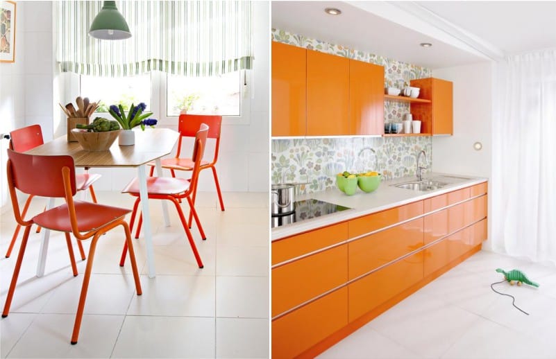
- White. This combination has become a classic. White in this variation absorbs the warmth of orange, emphasizes its brightness and juiciness. White-orange facades will organically fit into a spacious or small kitchen make it cozy and sunny.
- Blue in warm shades. A combination that will make the interior boring and modern, reminiscent of the warm sea and the bright sun.
- Shades of brown. This combination will be appropriate even in fairly laconic interiors, typical of oriental minimalism. Neutral brown dilutes the saturation of orange, allowing it to acquire a noble sound.
- Green and its shades. A color tandem that can be found in nature, therefore, in everyday life it looks quite harmonious. Facades in green and orange tones will become an accent in the kitchen, and will appeal to self-confident, ambitious owners. Depending on the chosen shade, the furniture can acquire a more gentle or expressive sound.
- Gray. It will be a great addition to orange facades, this combination has a positive effect on the psyche and pleases the eye. Psychologists note the calming effect of the gray-orange range.
Choice of table top color
There are many colors of the spectrum that harmonize with orange, so the countertop can have almost any color that meets the requirements of the style you choose.
- Dark or light wood. Natural softness of shades natural wood makes orange even more expressive.
- Black. The black tabletop looks spectacular and modern, this combination will appeal to connoisseurs of Art Nouveau style.
- White. White color will not make the room heavier, so it will fit perfectly into a small kitchen.
- Cherry. If you are looking for a non-standard solution, then opt for a cherry countertop.
- Olive. A harmonious union of colors in natural colors.
- Gray. The countertop in this color will balance the active energy of orange.
- Metallic. An active orange color can be balanced with a cold shade of metal. Appliances with a chrome surface will complement the metallic-colored worktop.
How to make an apron
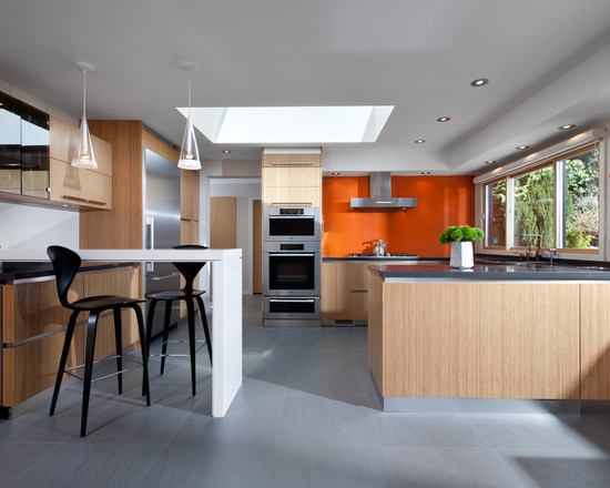
The apron can match the color of the countertop or differ from it. The accent in the kitchen will be in the fiery and sunny range. The mosaic protective panel looks very original in the country interior. A sheet of metal as an apron will be a great addition.
An orange-colored kitchen will not only give you a warm and sunny mood on long winter evenings, but even on a gray cloudy morning it will charge you with positive energy for the whole day. Just think, the dull rain does not stop outside the window, the end and edge of which is not visible, and an incredible atmosphere of summer fun reigns in your kitchen. And that's exactly what's missing modern man in the bustle of the city.
It's no secret that the orange color has an obstinate character, and to find the right decision its use is not for everyone.
However, following the advice of experienced designers, you can easily achieve a great effect - a sunny and positive mood in the kitchen at any time of the year.

What is good about orange kitchen?
Psychologists note that this color is not only perceived positively visually, but also has a beneficial effect on the psycho-emotional state of a person. Thanks to the orange kitchen, you will forget about mood swings, apathy and seasonal depression.

And, in addition, warm orange color has a positive effect on the normalization of the genitourinary system and intestines, it is even able to save a person from headaches. However, there is a downside here: by stimulating the body's receptors, orange leads to increased enjoyment of food, so in such a kitchen you will want to snack as often as possible. That is, for those who are on a diet or are struggling for a slim figure, it is better to pay attention to a different color of the kitchen interior. Well, or use less saturated shades, such as peach or apricot.

Features of the use of orange in the interior design of the kitchen
Designers have long noticed that each color or combination of colors can affect the interior in different ways. Therefore, when developing a project for your future kitchen, pay attention to the characteristics of this color.
- Activity. Bright shades of orange are extremely active and can displace other colors from the room. So, if you have a brown floor, a white set and orange chairs and a table in your kitchen, then the attention of the incoming person will be automatically directed to the dining area. When planning your kitchen, keep this in mind and use rich colors very carefully, especially in large quantities.
- Heat. The orange palette is able to fill the room with warmth and light, which makes the use of shades of this color in decorating the kitchen north side home is ideal.
- Visual magnification. Orange color visually brings objects closer, so such furniture will seem somewhat closer than it really is. However, this property, when used correctly, will help to place the necessary accents in the kitchen.
- Layout correction. The quality of the orange will help to adjust the layout of the room to bring objects closer and larger. So, a narrow and long kitchen can be visually made more square, for this you just need to paint one of the remote walls with a rich orange color.
- Wide range of shades. The palette of orange is truly multifaceted, it has many shades, tones and halftones. You will have the opportunity to combine bright colors (tangerine, pumpkin and orange) with muted tones (pastel peach and apricot).

If you place the accents correctly, then the orange spectrum will fill even the darkest room with the illusion of light and sun at any time of the day. The charming warmth and softness of orange can create an indescribable comfort that can be enjoyed within any style.
The combination of colors in the orange kitchen
To emphasize all the advantages of your kitchen, you will need a competent combination of an orange palette with other colors. Designers advise using only proven unions in the design of the room, which can most advantageously emphasize the activity and saturation of orange. Among the main combinations are:
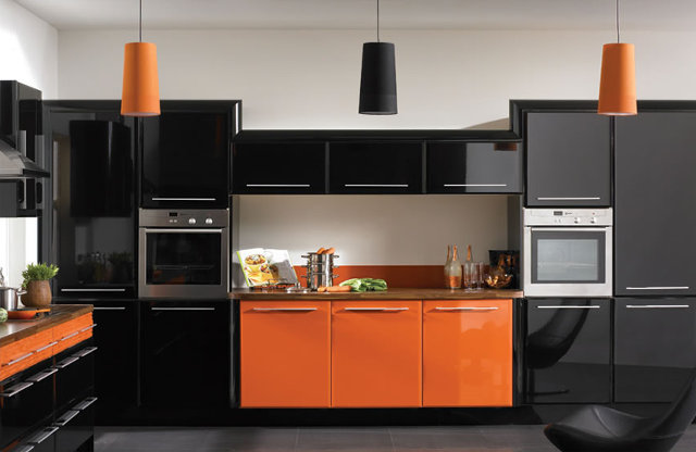
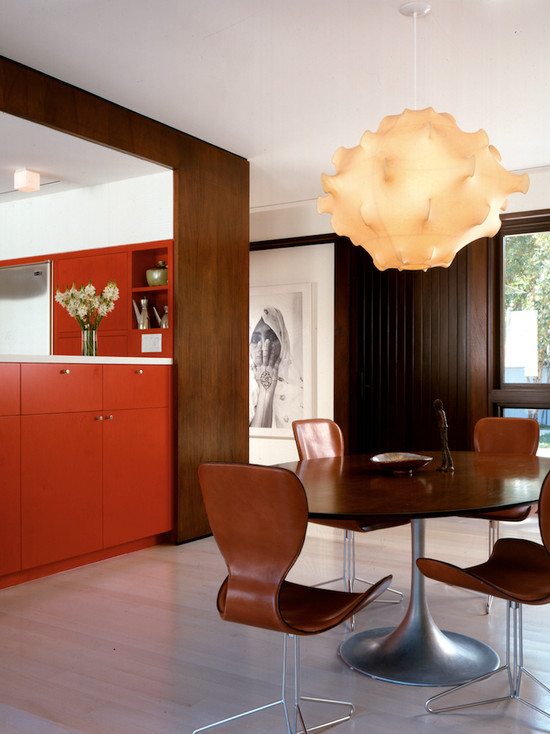
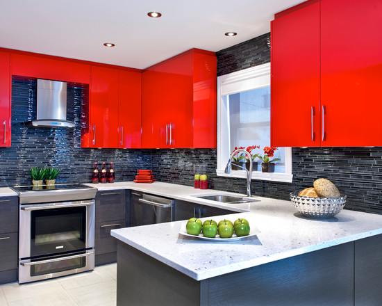
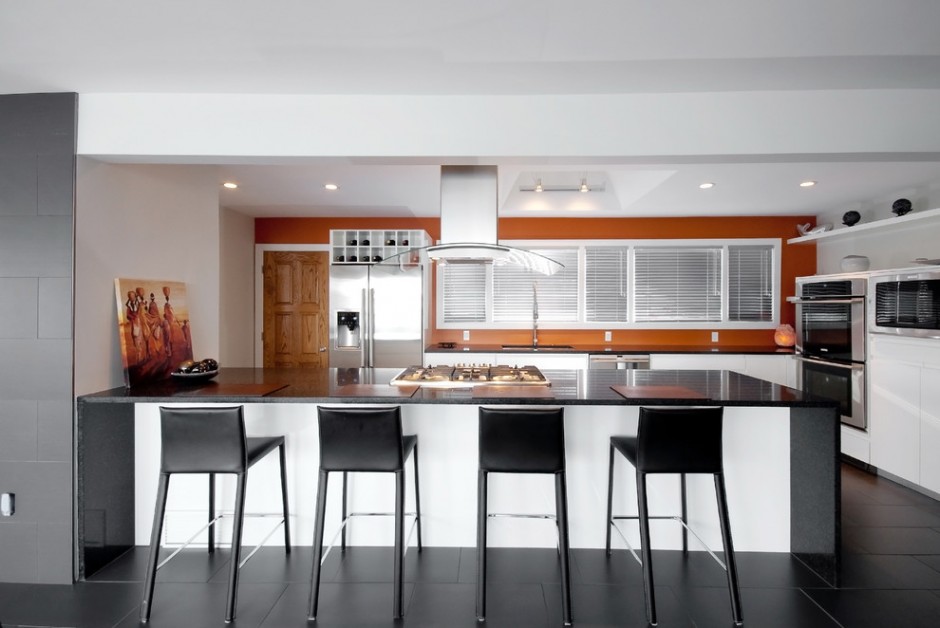
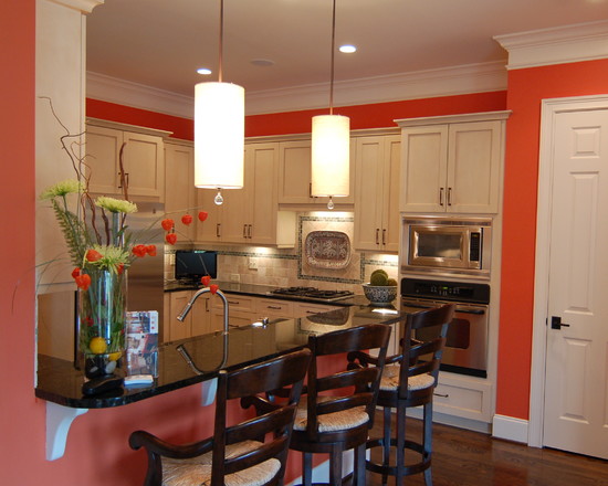
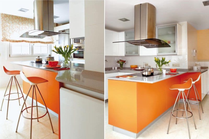
Black and orange kitchen
An unusually bold option for decorating a kitchen interior, while not forgetting that black should not be too much. If you overdo it, then the room can simply become gloomy and uncomfortable. Designers have one good rule about this: the better the lighting in the kitchen, the more black you can afford.
Owners of large kitchens can afford to use black as the main one. In this case, you should opt for furniture with a black facade. In this way, you can achieve excellent contrast against the background of orange curtains, dishes, kitchen apron or dining table. It is also worth noting that metallic household appliances look great with black furniture - a microwave, an oven, an extractor hood, etc.
As a base, orange is best used in small rooms, while it is advisable to focus on muted shades, rather than brighter ones. Black accessories combined with bright orange are tiring not only for the eyes, but also for the psyche.
Separately, it is worth dwelling on the decoration of the walls of the black and orange kitchen, this option provides for two of the most optimal solutions. In the first case, black furniture is required, then the wallpaper of soft peach color will be the ideal design for the walls. Such an interior can be perfectly diluted with white accessories.
The second option involves the use of already bright orange furniture in the kitchen. At the same time, you can soften the saturation with the help of light gray or beige walls, then black Appliances and countertop will harmoniously complement the interior of the room. Perfectly fit into such a kitchen and a black apron.
Designers believe that the most optimal black and orange palette in the kitchen will show itself in high-tech, classic and neo-gothic style.

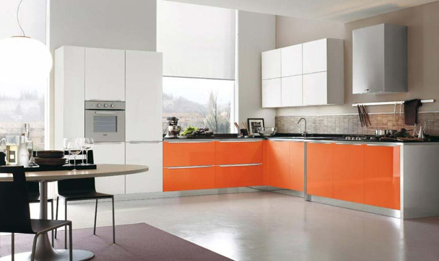
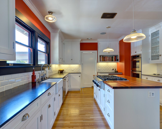
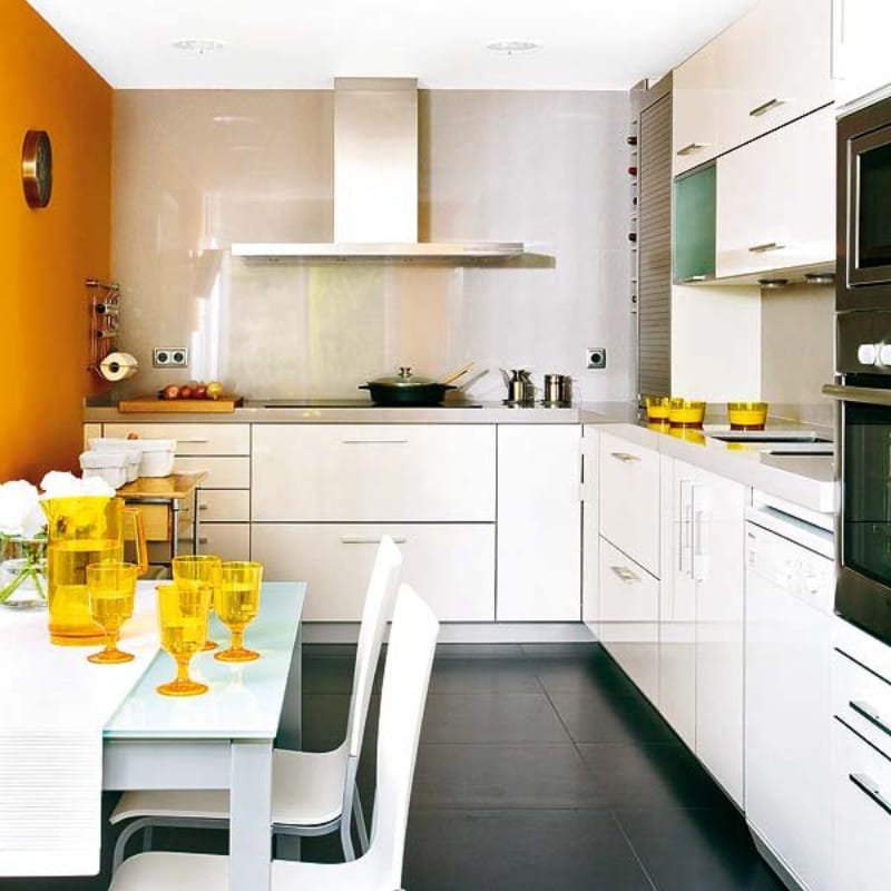
Combination of white and orange
A tangerine dining set will look much more expressive in contrast to the snow-white floor, and a tangerine-colored hood or apron will only emphasize the spectacular glossy furniture. However, white reinforces the already high activity of orange, so the combination of these colors must be approached carefully. The most harmonious solution would be to use muted tones of the orange palette in a white kitchen.
orange blue kitchen
The combination of blue and orange has long been a classic, because these colors are opposite, so they perfectly balance each other, creating a truly unearthly harmony in your kitchen. How to unleash the full potential of such an alliance? It all depends on how you decide to decorate your kitchen, on the size of the room and furniture, as well as on the style in which you want to make your kitchen orange. Not infrequently, these two colors are used in the design of one headset, or they are used to paint patterns on the ceiling, walls or floor. For example, if the windows of your kitchen face the sunny side, then the severity of the cold blue will help offset the excessive activity of warm orange.

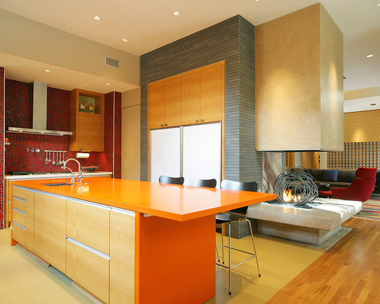
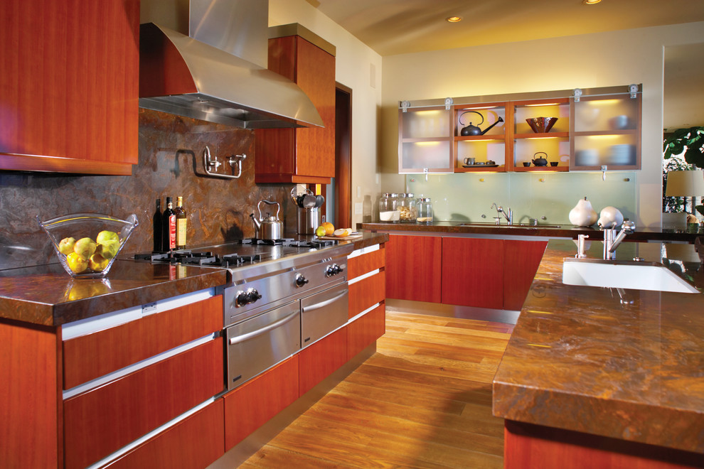
Combination of wood and orange
A tree, considered a symbol of comfort, is able to balance the activity of the orange spectrum. However, it is better not to use it as an equivalent element of the kitchen interior, but simply make it a stylish background. For example, parquet or laminate made of light wood will look great with a tangerine set, and peach wallpaper and ceramic tile will be an excellent backdrop for light furniture in the Provence style.
![]()
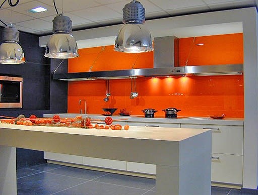
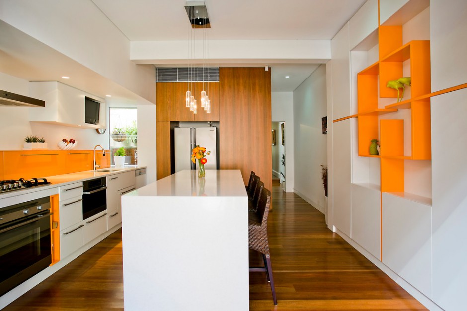
Metal and orange color in the interior of the kitchen
The coldness of the metal is a great addition to the active orange palette. Moreover, chrome-plated and aluminum household appliances are in the lineup of almost all leading manufacturers. A stylish accent will be the metal edges for the headset, as well as accessories and elements made under steel dining area. At the same time, in order to create a trendy techno or hi-tech atmosphere in the kitchen, it is enough just to combine glossy furniture facades and metal within the room, and the clarity of lines and the minimum number of accessories will only complement the strict magnificence of your kitchen in orange colors.
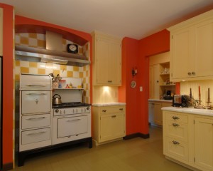
brown orange kitchen
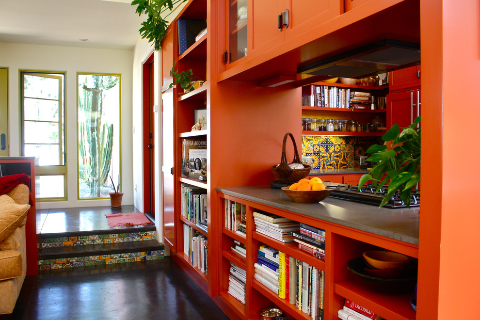
Natural terracotta color is an indispensable component in the creation of oriental decor.
To achieve peace and harmony paired with brown, it is best to use orange shades: honey, apricot and pumpkin.
green orange kitchen
The union of orange and green gives an unforgettable feeling of joy and warm summer, and the combination with gray has a positive effect on the human psyche.

Companion colors
Delicate green shades will also feel great in an orange kitchen. So, olive or pistachio color will become simply indispensable for covering the ceiling, floor or walls. In addition, they perfectly complement orange when decorating a decorative window or panel.

How to decorate your kitchen in orange
Neutral shades go well with bright orange flowers. Their range is very extensive: beige, sand, light gray, pale pistachio. And to calm the interior, a better ally than milky white is simply not to be found.
The best solution would be to use furniture with orange facades in your kitchen, which can be complemented with stylish orange accents in the backs of chairs or tablecloths on a snow-white table. And vice versa, you can stop at neutral furniture, but at the same time make an apron in orange tones.

Bright color is in itself an unsurpassed decoration for the kitchen. That is why, decorating your kitchen in orange, designers recommend paying close attention to minimalism and other concise styles.
Since orange visually brings objects closer, it is not entirely appropriate to glue wallpaper of this color in a small kitchen. But this property of orange will help you adjust the volume of a narrow and high kitchen, for this you just need to paint the ceiling in this color, due to which the walls will visually expand and the ceiling will go down.
Separately, it is worth mentioning that the orange walls can give cooked dishes a very appetizing shade, which will surely please any hostess.
To decorate a high-tech kitchen room, there is simply no better solution than gray and black furniture against the backdrop of orange walls.
A great combination for the kitchen is also the union of pale green and orange. But at the same time, do not forget that shades of orange look harmonious only with warm shades of other colors.
When using orange tiles in the kitchen, no matter on the floor or backsplash, it would be better to use neutral colors for walls and furniture facades: light green, various shades of beige or gray. At the same time, the brightness of the color of the facades can be enhanced if there is a white apron in the orange kitchen. But professionals do not recommend using pink and purple colors in this situation.
The same rule should be followed when choosing curtains for the kitchen. And it doesn’t matter at all which curtains you decide to hang: roller or Roman, Japanese panels or curtains like in a cafe - curtains in warm and soothing colors should definitely hang in an orange-colored kitchen. This rule is relevant, and provided that the kitchen has a set in calm and light colors, then orange curtains will perfectly complement the interior.

Do not forget that orange crowds out all other colors, so when a person enters your kitchen, he will pay attention first of all to orange interior items, and it doesn’t matter if it is furniture, curtains, floors, accessories or walls. Therefore, think carefully about what would be best to focus on.
Kitchen lighting in orange is a different story. A large amount of light is very important here, and it does not matter if it is artificial or natural. Therefore, carefully consider the selection of lighting sources and curtains. Great solution to use spot lighting as well as lamps and floor lamps.
Orange kitchen furniture
It is worth noting that the orange interior of the kitchen involves the use of bright glossy and semi-gloss facades of a concise form. Facades of curved shapes with rounded outlines will also look very impressive. Regarding the preferred color solution kitchen set the choice is incredibly extensive: you can completely paint it orange or give this color only to the upper or lower facades.
Shades of zebrano, bleached oak or wenge combined with a sunny color will fill your kitchen with a sense of harmony and peace. An interesting solution will become glossy stretch ceiling in which, like in water, the facades of your kitchen will be reflected.

Well, for those who are frightened off by the “flashy” energy of orange color, but still have a desire to make the interior of their kitchen in orange tones, designers recommend using calm shades, such as yellow or peach. An excellent solution would also be to dilute the intense orange color with pale white. It can be a white lampshade or tablecloth, as well as a dining set.
To create an organic kitchen interior, you must not forget about the rule of balance. To do this, simply balance a bright color accent with less active details. Otherwise, an excess of brightness can only cause negative emotions and irritation. For example, a bright tangerine set will look great against the walls in pastel colors(cream or beige), and if you add a few accessories in desaturated shades, then it will come out completely unsurpassed. This rule also applies in the opposite situation, when the headset is made in a soft palette, and the accents, on the contrary, are placed in rich colors.

Even if you decide that an orange-colored kitchen is not for you, orange accessories will help bring brightness to the room, placing the right accents on which you can achieve an incredible effect.
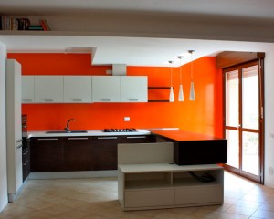
Photo gallery - Orange kitchen:
![]()


![]()


As you know, orange is undesirable for decorating bedrooms and living rooms, but it will look very organic in the interior of a kitchen or dining room. And yet this color cannot be called neutral, so even in the kitchen you need to use it wisely. Our tips and a selection of beautiful photo ideas will help you create successful combinations, maintain the correct proportions of colors and choose wallpapers, curtains, furniture in the right shades.
General characteristics
The orange color is formed from a mixture of yellow and red, and therefore its properties are in many ways similar to the "parents".
- Psychological impact: it also attracts attention, like scarlet, but is less aggressive and does not cause a feeling of anxiety. And our hero inherited energy, vivacity and the ability to improve mood from yellow. Unfortunately, such traits as obsession and the ability to annoy when used in large masses are also characteristic of him.
- Optical properties: has the ability to visually bring closer and increase the volume of furniture and walls, but at the same time, without making them look heavy. Another important feature is its warmth.
Tips for Using Orange in Mass and Accent
Orange, despite its brightness, can be used as the main one in a 1: 1 ratio with another color, but only in some cases:
- If the kitchen is large and lacks a sense of comfort and intimacy;
- If it faces north and is poorly lit;
- If you and your family lead an active lifestyle, temperaments and mobile.
Tip: if you want a lot of orange, then the best option there will be a gray, beige or white-orange kitchen.
Below in the photo slider are examples of orange kitchen design.
Still, the abundance of this energetic color looks quite extreme, it is much safer to use it only as an additional one (in a ratio of 1:3, 1:4, 1:5). So you will bring the necessary impulse of energy into the interior, a feeling of warmth, and you will not get tired of the atmosphere for a long time.
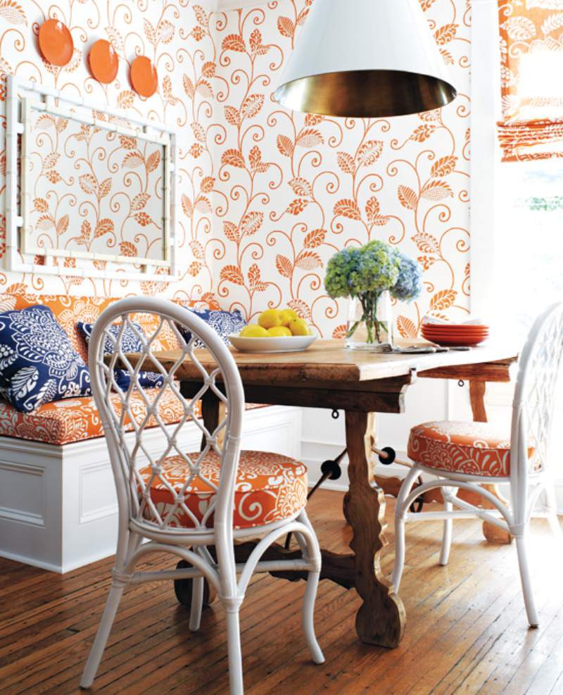
Orange can be: wallpaper on an accent wall, curtains, an apron, countertop, part of the headset, chairs, dishes and / or decor. Examples of such accents can be seen in the following selection of photos:
Tips for Enlarging a Small Kitchen with Orange
The abundance of orange will only reduce, but you can beat the optical properties of our hero (the ability to visually zoom in and enlarge walls) to your advantage in the following ways:
- Highlighting one accent wall in orange, and decorating the rest in beige, gray or white, you will make the ceiling a little higher.

- By painting half of all the walls or a fragment of one wall (for example, an apron) in orange, you will visually make the kitchen wider and more spacious.

Tips on how to choose shades based on the style of the kitchen
The most suitable styles for orange are: , all ethnic (Mediterranean, Spanish, Oriental, Mexican, African), modern ( , ) and, of course, the style of the 60s.
- The more modern the interior style of your kitchen, the more saturated and pure shades you can use: orange, carrot, pumpkin, cinnabar.
- Conversely, the more traditional the setting, the stricter the shades of orange should be. Suitable shades with an admixture of brown: ocher, mustard, honey, amber, terracotta, brick, rusty, chestnut, etc. It is worth adding that classic Empire, Baroque, Rococo are not very fond of orange.
Here's how orange looks in a kitchen interior with a hint of the 60s era.
Also see our other articles:
And this is how it is in the interior (scroll the photo to the right).
An example of an orange and white dining room in a classic style.
Companion color tips
Harmonious color combinations are already half the success of any interior design. When planning which wallpaper, curtains, apron and other items you want to purchase, you need to clearly imagine what you want color design kitchens. To figure out which colors will be combined with orange, you can use the Itten color wheel. The basic principles of working with it can be found in the next video tutorial.
Here are our tips:
- In a monochrome range, darker shades of orange are combined with its lighter tones, as well as with similar colors - red, yellow, brown, beige. Monochrome warm range will be very cozy and warm, but perhaps appropriate in the interior of the "northern" kitchen.

- In a contrasting range, combinations with opposite colors in the spectrum - blue, turquoise, blue are appropriate. Combining orange with cold colors is especially necessary if the kitchen windows face south. Contrasting alliances with black, white and gray will also be successful.

And now photo examples different cuisines:
- - this is the most win-win and versatile combination that can be complemented with almost any color.
- Black and orange kitchen- appropriate in the interior of kitchens in modern style, especially for .
- will be very pleasing to the eye, but so that it does not resemble a cafe, it should also be diluted with a large proportion white color as shown in the photo below or so that the shade of green is unobtrusive.
- And finally, a photo grey-orange cuisine. Gray, like white, balances the vigor of orange colors, and itself becomes livelier and more interesting.


Tips on how not to do it or you can do it, but with caution
- When compiling colors kitchens, keep in mind that combining orange with a shade of red, close to purple, will not be the best idea.
- The most annoying and even slightly psychedelic combination is orange + pink. It may only be appropriate in a pop art kitchen, but pink should still be kept to a minimum.
9 average score: 4,44 out of 5)